Wildfire Risk to Communities
Project overview
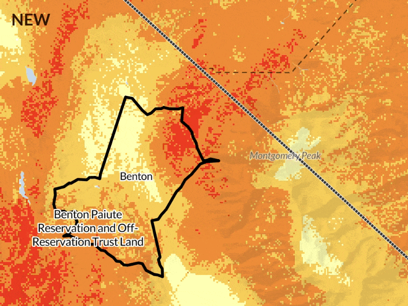
Wildfire Risk to Communities is a platform by the U.S. Forest Service to help communities understand and reduce wildfire risk. It is used more than one million times each year in all 50 states.
As the design lead for the platform's Explore Risk application I've worked on projects from tiny tweaks and improvements to researching, testing, and building brand new features.
Client
Headwaters Economics / USDA Forest Service
My role
Design lead, Frontend

Usability & Accessibility testing
Making wildfire risk information and tools available to everyone in impacted communities means that they must be as easy to use and accessible as possible. Since its launch in 2020, the tool had evolved organically, as did its user base.* When I joined as the design lead in 2022, it was time to check how we were doing.
* While originally intended for community leaders (elected officials, community planners, fire managers), the general public and news media have become an increasingly large user group.
Usability Testing Process


Testing showed that both pro and novice users struggled to get started using the tool. Our data was the best available, but users needed more help making sense of it.
Clarity in complexity: Risk information designed to be understood
Wildfire risk is complex. We try to strike a balance between scientific accuracy and plain language information since the app is used by both professionals and non-experts. Testing showed that non-expert users often didn't encounter explanations in the moments they needed them.
To address this issue holistically, I inventoried the app's content: When are assumed familiar, when are they introduced? From there, I revised the information architecture to mirror how users expected to encounter information.

Based on testing insights I made tweaks all over the app, from improving the navigation to creating and applying a design system to improving accessibility to highlighting call-to-actions to making our copy more understandable* to our audiences.
* This one is always a tug-of-war with the wildfire experts, me asking "Can we just say place instead of populated area?". (Hint: it's not that easy)

On Risk Detail pages I improved the header section (to help users contextualize the data they're seeing), and the map, and plenty of other stuff that I'm happy to tell you about if you ask.

Established an accessible design system
As things go without a system in place the UI had gotten a little messy over time. I established a design system that created consistent affordance of interactive elements, typography and color scales across the application. Usability and accessibility improved (we now meet WCAG 2.1 AA criteria), and efficiency for design and development increased.
This work was informed by usability testing and a comprehensive accessibility audit* that showed we needed to do better, especially in supporting users of assistive devices. All software should be. U.S. government-funded software has to be (according to Section 508 of the Rehabilitation Act).
* I followed a hybrid approach of automated testing (using Accessibility Insights for Web) and manual screen reader evaluation using the CANAXESS framework to make sure our tests focused on the critical parts of the user experience and remained reproducible across screen readers and devices. I wrote about the process on the E84 blog.


A visualization that clearly shows what's at stake
The new Risk Reduction Zones feature shows which mitigation actions are most effective in different areas based on land characteristics.
Before we even had this data, I tested the approach with several user groups using a dummy mockup. People liked it! Based on their input we chose a name for the page and tweaked the language explaining the four classes.
The dataset is presented spatially and aggregated to the selected place. I visualized it on a map and an infographic.

Doesn't use the yellow-to-red risk scales found on other pages. Accessible. Looks nice. Avoids misleading connotations. Goes well with the rest of the maps in the tool.
Visualization process


I considered responsive behavior, how to round numbers, and worked closely with a software engineer to ensure we got these details right in production and made the chart accessible to screen readers.

Here's the final design. Risk Reduction Zones are introduced in understandable language, with accessible data visualizations, and through a relatable chart that connects abstract percentages with the homes they describe.

A Better Map
Test participants struggled to orient themselves on the map. Participants were also sometimes confused by existing map features such as community boundaries. On the Vulnerable Populations page, highlighted census tracts were hard to distinguish from the risk layers. We needed a better map.

I also improved the map UI, such as the color scale legends. On mobile, large overlays move above and below the map to save space.

Complex map iterations made simple
The Vulnerable Populations combines demographic data about vulnerable populations with wildfire risk data to identify where people may be especially vulnerable to wildfire. This allows city officials to direct outreach efforts, for instance.
We already knew from previous tests that the feature was too hard to use. Users struggled with the UI for selecting vulnerable populations.
I iterated quite a bit on this one and tested prototypes internally and in structured user testing.
Iterations


While the rest of the application uses animation very sparsely, here we made the pills animate their state change to help the user understand what is happening. I wrote the React code for this feature.
The redesign allows users to quickly identify at-risk communities in high risk areas and prioritize interventions that protect the most vulnerable.
Oh and did I mention that the whole thing is fully keyboard and screen reader accessible?
Navigation
Test participants explored risk comparatively: They compared risk in their community with nearby places and areas they knew had burned. But the app didn't encourage revisiting previous places or comparing places of interest.
I explored adding a visualization to the Overview page that would show users how the selected place compared to others nearby. Everybody liked it.*
* Remember how I wrote wildfire risk is complex? Well, the team could not figure out an algorithm that could select a useful set of related places and didn't make un-scientific claims about comparative risk, so we ultimately did not move forward with this idea.

I did get it through to integrate the platform and app nav menus* so users can more easily jump back and forth between our app and the static resources offered by the platform.
* Which was a whole thing because our React app runs within a Wordpress platform...
To preserve screen real estate, the platform nav scrolls out of view while the app nav sticks to the top of the screen. When navigating between pages, the platform nav stays out of view. On mobile, the search bar also leave the screen so only the tabs remain visible at all times.
We also added search history to make it easier for users to revisit previous searches, supporting comparison between places.
I designed the UX/UI and helped with frontend development, focusing on ensuring useful screen reader announcements.
Outcomes
I transformed the Explore Risk tool from a one-off design into a scalable platform by establishing a well-documented design system, streamlining future feature development for designers and engineers.
My accessibility improvements — both in design and code — raised WCAG 2.1 compliance from 77% to 96% in Accessibility Insights, ensuring Section 501 compliance and improving access for assistive technology users.
Preliminary testing suggests the redesign will drive higher engagement, empowering community leaders and the public to better understand and mitigate wildfire risk. From now on, we can quantify it: My quantitative work capturing the SUS score creates a baseline for future evaluation.