The Politics of Design
Oct 21, 2016I just finished reading The Politics of Design by Ruben Pater.
Are we as creative professionals really aware of the political meaning and impact of our work in today’s network society? This book examines cultural contexts and stereotypes with visual examples from around the world. It demonstrates that communication tools are never neutral, and encourages its users to rethink global cultural understanding.
The book is a concise collection of examples, organized according to formal elements of (graphic) design: language and typography, colour and contrast, image and photography, symbols and icons, and information graphics.
I'd like to expand on one example from the book that I found particularly interesting, although it actually is more of an example for cultural/racial bias in engineering than in design. Meet Shirley:
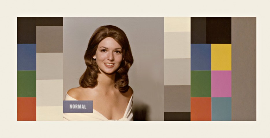
So-called “Shirley Cards” were used by Kodak in the 1950s, 60s and 70s to calibrate colour film for white skin just like Shirley's, which made people of other races appear too dark in the pictures. Ruben Pater writes:
Test images are designed to represent a default, a set of standards for optimal image analysis. But tools are never completely neutral, and their settings reflect the cultural bias of the technicians who calibrate them.
This demonstrates that we as designers don't just need to be aware of political implications inside the designs we produce, but that even the tools and methods we used to arrive at that outcome impose on use the political context of their creation.