Net Zero Finance Tracker
Project overview
Since the Paris Agreement, financial institutions have made many promises to take climate action, sometimes under pressure. But how are they doing?
I helped Climate Policy Initiative turn their research into a data dashboard. The Net Zero Finance Tracker brings transparency to where some of the world's largest financial institutions stand on their climate commitments.
Client
Climate Policy Initiative
My role
Proposal, UX/UI, Frontend
Background
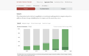
The Net Zero Finance Tracker (NZFT) provides a comprehensive assessment of how public and private finance institutions are progressing on Paris Agreement goals and delivering net zero impact on the ground.
The tool is meant to help regulators and coalitions understand progress, implementation, and gaps in order to inform their response to climate inaction — to push finance to fight climate change and drive us closer towards meeting the goals of the Paris Agreement.
After building a UK-only beta version, CPI came to Element 84 with concept sketches of what they were imagining for the next version of the NZFT: an expansion that would include data for financial institutions world-wide.
Abbreviated discovery
The project happened on a condensed timeline and with a limited budget. I led a kickoff workshop with project stakeholders to align on process and goals. Using a Rose/Bud/Thorn activity, participants were able to share what they liked about their concepts and where they felt they were lacking. The workshop and the requirements captured in the contract formed the bases for the ideation and design phase.
Ideation and design
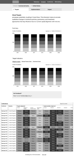
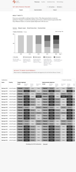
I designed wireframes for data aggregation and single entity pages. In a total of three iterations, I incorporated client feedback. Finally, I applied the client's brand colors and typography.

Design considerations
Legend
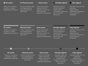
Since charts and tables across multiple pages all shared the same data, and the progress scale was the central element of CPI's assessment, an initial concept was to carry the legend across all pages, affixed to the bottom of the window. This idea was ultimately abandoned in favor of a more traditional legend UI.
Tabs
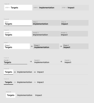
The NZFT considers institutional action across three dimensions. Targets, Implementation, and Impact. Each dimensions would become a tab in the app's Explore section. As institutions generally move through dimensions in order, I explored a tab interface that communicated this progression using arrows.

Charts
Data scientists at CPI had already picked chart types and the dimensions they wanted to visualize. I helped them refine their concepts by applying best practices and designing accessible color palettes.
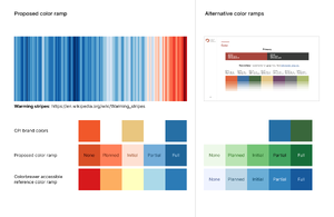
I created multiple color schemes based on CPI's brand colors. I explored a concept of using a color ramp inspired by the famous warming stripes visualization. Symbolically, institutional climate action corresponds to cooling. Red is also commonly associated with warning/danger.
Ultimately, the client went with a monochromatic gray-to-green scale for the Response scale, and several supplementary scales for fossil fuel investments (red) and categorical data (multi-hue).


Final design
Aggregate charts
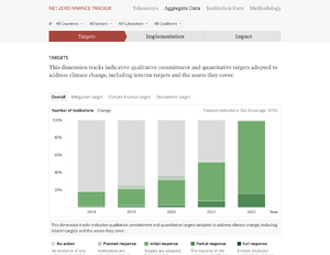
In the “Aggregate Data” section, users can visualize data according to “Target,” “Implementation,” or “Impact”. Filters can be applied to the visualizations, allowing users to tailor their insights by “Sector,” “Subsector,” “Country,” or “Coalition.” This enables more targeted analysis of climate finance information based on user needs.
Institution table & entity page

The “Institution Data” section gives users access to granular entity-level data, encompassing all dimensions and indicators scores. It includes a list of entities, with the option to filter by “Sector,” “Subsector,” “Country,” or “Coalition,” similar to the “Aggregate Data” section.

Users can select desired entities, or search for them by name, to access entity level pages showing their scores and specific actions. Within each entity page, users can click to view the description of indicators and the observed actions that led to the score of each entity indicator.
Implementation
A E84 software engineer wrote a data ingest script that formats data for use on the frontend. I implemented the frontend using Astro, a static site generator, that generates static pages from ingest scripts. State management for filters is stored via URL. The charts are built using React. The biggest complexity was in the table with its sticky headers and sort feature for every column.
The application is hosted on Github pages. CPI can update the data by pushing a new source dataset to the repository and triggering a deploy.
Go to websitenetzerofinancetracker.climatepolicyinitiative.org/targets
Impact
CPI's Climate Finance Tracking Program uses the NZFT to provide governments, climate funds, development finance institutions, philanthropies, and private investors with accurate data on the current scale, sources, instruments, and uses of climate finance.
Read the press release for a summary of preliminary findings.