Lake Protector Application
Project overview
The water quality at one of the cleanest lakes in the U.S. is declining due to human impact. Lake George Association, a nonprofit with a mission to protect Lake George, wanted to create a web application that shows property owners their contribution to the lake’s water quality issues and tracks progress in mitigating them.
Client
Lake George Association
My role
Discovery, UX
Workshops & Interviews
To help Lake George Association (LGA) better understand what type of application would be most used by property owners around the lake, I led two stakeholder workshops and interviewed nine Lake George (LG) residents.
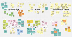
I helped stakeholders align on the project's goals, challenges and opportunities, identify relevant datasets, and identify and prioritize prospective user groups. A Rose, Bud, Thorn activity helped us align on where previous efforts had worked well or fallen short.
Next, I interviewed nine Lake George residents, among them seasonal and year-round residents, local builders, and decision makers in municipal government. The research objectives were to:
- Understand how users currently engage with the lake’s water quality issues.
- Understand what information would motivate a user to take action.
- Identify any problems or communication barriers with LGA’s science- and data-forward approach.
Findings
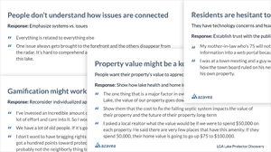
An immediate finding in the interviews was that motivated homeowners, who the client had expressed as their main user group, expressed no need for a web application. They needed on-site help by professionals to carry out specific projects, a specificity not feasible with the available (or likely any) GIS data.
While the majority of interviewees were in this group, we gathered a lot of second-hand knowledge about friends, neighbors, and relatives who were less invested. This group voiced a number of issues that LGA's approach was not currently meeting but could be addressed through technology:
- They want to do the right thing for the lake but are dissuaded by inconvenience, e.g. construction in the Summer months, or not being able to plow a permeable driveway in the winter.
- They don't ask for help because they fear costs of projects, or fear penalties when alerting the local government of their failing septic system or the like.
The outcome of this phase was a comprehensive report of insights gathered from interviews and the workshop, as well as three user personas.

Design concept
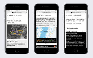
I saw an opportunity in creating an interactive application around “Protector Profiles”, property assessment print-outs that a LGA lake scientist and GIS specialist would manually compile for interested property owners based on datasets such as slope and stream data, as well as invasive species and algae bloom monitoring. To offer these reports at scale, we would need to automate this laborious process (which the creators appreciated!). I brought in our own GIS specialist and a software engineer to assist the client with that process.
The available data and the analysis possible with these data dictated the scope and information architecture of the application, paired with the expertise of LGA staff on how to respond to various conditions.
Based on this information I developed a user journey that would present Protector Profile information to user personas in a way they would find relevant and guide them towards taking action. I then iterated on wireframes for a responsive, mobile first web application.
50% of visitors to the LGA website already visit on a mobile device. Tablets can be used by the client at outreach events, and desktop will accomodate home users. You'll notice that these designs are mocked up on an older iPhone. Not everyone has the latest gadget.
The remainder of this case study breaks down how specific discovery insights impacted design decisions.
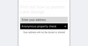
Individual/personalized but anonymous. Low barrier of entry.
Insight: Residents are skeptical of sharing information online. Some fear fines or even losing their homes if they asked for help with their failing septic system. I wanted to lower the barrier of entry and make it clear that users can get answers anonymously.
Organized around the property, the individual, not the lake.
Residents struggle to understand how different environmental threats to the lake are connected. One way of seeing it: they all relate to your property!
I also applied insights from behavioral science*: People assign greater value to information that’s specific to them over more general information (Base Rate Fallacy).
(* Note that this project is not itself a behavioral science-based work. I did do an internal research project beforehand to learn about behavioral design and the ethics of applying it to motivate climate action. The answer? It's complicated.)
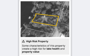
Framed in terms of risk to lake and resident
The application frames lake protection as a way to mitigate risk to the homeowner. Property value is a key concern to lake residents. A quick literature review brought up studies that tie water clarity and algae concentrations to property value.
The design plays to Loss aversion, a cognitive bias most people have: the pain of losing something is psychologically twice as powerful as the pleasure of gaining.
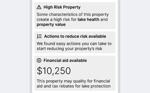
Accessible for older residents
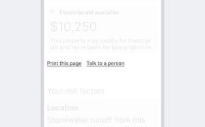
The demographics of the lake population require that the application be especially accessible to older residents. WCAG web accessibility is one part of this. Another is makeing it easy for residents (or their relatives) to print out reports.
The app also allows residents to get in touch with LGA staff (who in turn can use the app to triage and prioritize which residents to help first).
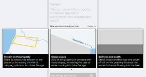
Digestible data
Geospatial software tends to immediately resolve to data dashboard. This is often not the most effective strategy. My interviews showed that residents are already overwhelmed by too much information (LG is the “smartest lake in the world,” thanks to an IBM project).
My design presents geospatial analysis as easy-to-understand cards, each making a single point. The format would also create constraints for LGA, who is good as assembling information but often struggles to bring it to the point, in layperson terms.
The actual visualizations shown are low-fidelity mockups.
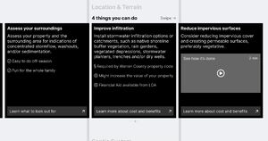
Actionable recommendations
Similar to the data cards, recommended actions are presented compact, step-by-step, easy to do. While the content is just a mockup, it shows how to communicate more effectively with property owners by relating to convenience, cost, and regulation, alongside environmental benefits. For example by mentioning that surveying your property for streams can be fun for the whole family, or by pointing out that improved infiltration would benefit both lake and property value.
Multiple ways to get engaged
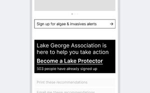
One goal of the concept is to get residents involved even if they didn't want to take more action as lake protectors just yet. I designed multiple on-ramps that allow to do something small, such as signing up for invasive species alerts. (Action Bias: we prefer doing something to doing nothing.)
Outcome
The concept was received enthusiastically by stakeholders and they requested a proposal for a next phase. I outlined a design process that included a content workshop to determine which datapoints to surface and how to visualize/communicate them, as well as user testing to evaluate that approach, followed by visual design and development.
Unfortunately, the project ultimately didn't move forward to the next phase.