The 50 Hottest Places in U.S. Politics
Project overview
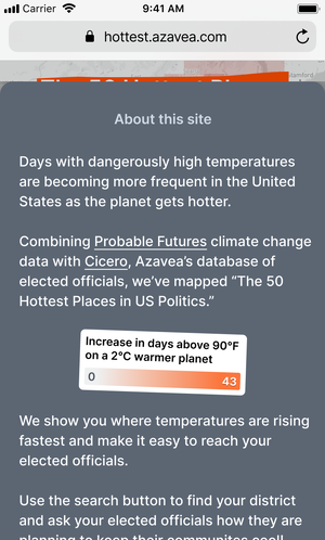
Days with dangerously high temperatures are becoming more frequent in the United States as the planet gets hotter.
Combining climate change data with a database of elected officials, I designed a web-based tool that informs the public on the local impacts of extreme heat and connects them to their political representatives in order to hold them accountable.
Client
Probable Futures, Mapbox
My role
Discovery, UX/UI
Background
Probable Futures, a nonprofit climate literacy initiative invited Azavea to use their climate data in interesting ways.
I approached the project by thinking about how to present climate warming information in a way that drives action. We often see climate change visualized on global world maps, but the effects are felt locally. This is also where most people would be most compelled to take action.
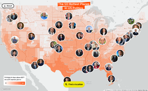
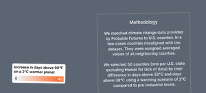
Together with a data scientist I aggregated local warming effects by political boundaries (counties) and ranked those counties by warming severity. We then layered in Cicero, Azavea’s in-house legislative district and elected officials database. Now the user could see the data on climate warming but also be empowered to reach out to their local elected official to demand action.
Solution
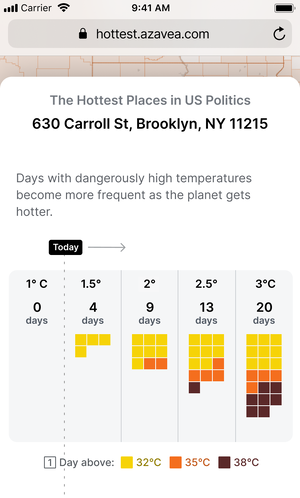
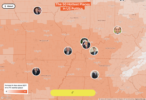
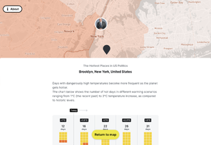
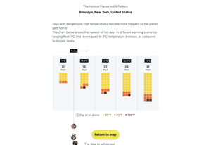
I designed a responsive, web-based tool showing which counties in the U.S. are warming the fastest. Users can find their city, county, or state to see how many days with extreme heat are forecasted in their location based on warming scenarios of 1.5°C to 3°C above pre-industrial level.
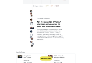
The tool also invites users to reach out to their elected officials to demand action, such as increasing access to cooling locations. To help with that, the tool shows contact information for the user's local and state officials.

Noteworthy Design Choices
Calendar visualization
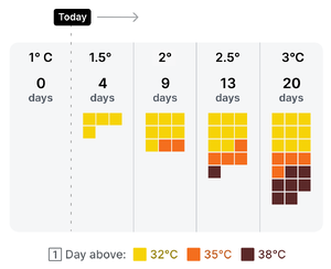
When you select a location you see heat days in a chart inspired by calendar sheets. This was a choice to represent hot days not in an abstract line chart, but in something tangible. Most people can remember a past heatwave and imagine the hardship of future heat.
Visual design
As a playful design element, some of the elements on the page are rotated by 1°, 1.5°, or 2°. The visual design picks up on the temperature changes that come up in many climate change conversations.
Responsive design
